I recently saw a promoted Tweet for Elevated Careers, a job matching website from eHarmony, and was immediately intrigued. Given eHarmony’s great track record for personal matchmaking, I was interested to see how the company would fare in making a professional match. I decided to check it out, and along the way, I made a few observations about the onboarding experience.
Sign Up
Signing up was straightforward. You answer a few basic demographic questions, upload a resume, and then go through their values questions.

One of the first thing I noticed was that clicking on one of the numbers takes you straight to the next question. I didn’t immediately realize that the questions progressed in this way, and I accidentally answered a second question without reading it before I noticed. Fortunately, the back button was clear enough, and I was able to solve my mistake easily.
Given that experience, it’s not surprising that I disliked this feature. However, all things considered, I think it actually makes a lot of sense. For one thing, it potentially cuts the number of clicks required in half by eliminating the need for a “Next” button. Secondly, although I tend to overthink this type of question and like to be able to change my answer a few times before I commit, the most accurate answer is probably the first one that comes to mind, so forcing the user to continue after making an initial choice may even improve the quality of the data.
Another interesting thing about this page is that it takes up the entire window — not even the navigation is visible — and there is never more than one question per page. My guess is that this is to encourage users to focus and complete the questions without getting distracted by other parts of the site or looking ahead at the next question.
If I could change just one thing about this page, I would add a progress indicator, such as “Question 3 out of 20.” Even when I chose to save my answers and return later, there was nothing to indicate how much of the questionnaire was remaining. I like to have an understanding of how much time an activity is going to require before I begin, so not having any idea how many questions were remaining was very frustrating for me.
Getting Started
After I completed the values questions and then another set of questions to assess my personality traits, I was sent directly to a page listing possible jobs, sorted by compatibility.

Throughout the job search results and details pages, you’ll see the orange tabs at the bottom offering to clarify certain aspects of the page content. I liked this use of progressive onboarding; however, I sometimes felt that the actual content in these tabs was too high-level.
When I clicked on “Details” for one of the jobs, I was taken to a “Compatibility Profile” describing how satisfied I could expect to be with the job and the company. I liked the idea of this but didn’t find all parts of the page very helpful, especially the culture section.

The meaning of the numbers presented in this section was not clear to me, and the orange info tab only explained the meaning of the headers, not how to interpret the numbers that went with them. Although the rest of the page was pretty clear, I think that this section would have benefited from some additional explantation.
Furthermore, a note at the bottom of this section said that these numbers were an estimate based on similar companies in my locale, as they did not have specific information for this company. Although, I appreciate the transparency with which this disclaimer was given, it did not give me any reason to place any confidence or value in these numbers.
I thought that the rest of this page was pretty easy to navigate and understand, and I think that the concept overall will be more effective after Elevate Careers has been around longer and acquired more data.
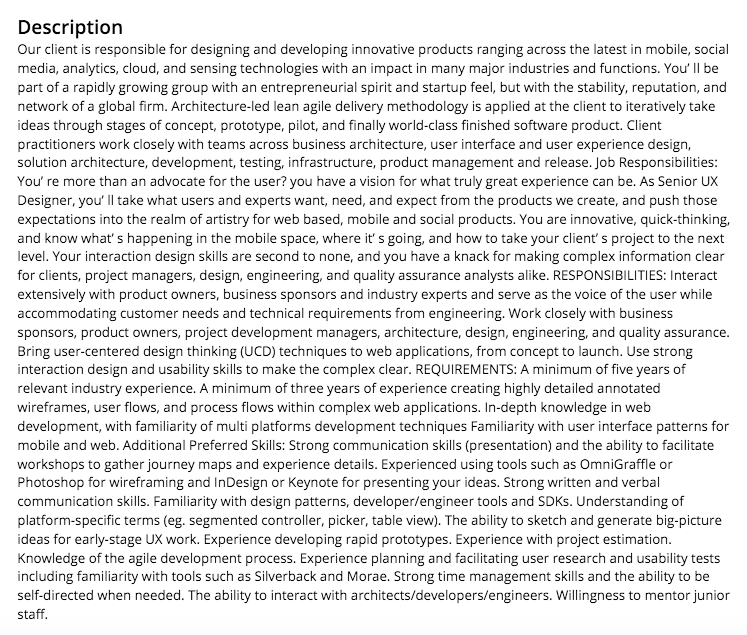
The “Job Description” tab, unfortunately, has no redeeming qualities. It is an unformatted mess:

It’s possible that not every job on there is like this, but every one I looked at was (please let me know if you have a counter-example). It was a nightmare trying to read these descriptions to find out if a job was actually appealing to me or not. Fortunately, there was also a link to the original job listing, so I could read it more easily at that way, but it is obviously not an ideal solution.
Even though it’s a pretty serious usability problem, I wouldn’t necessarily call it a UX design flaw, as I’m sure the designer never intended the content to display like this, and it just was an effect of how the information was pulled from their partnering sources. Hopefully they will find a solution for this technical challenge in the future.
Conclusion
Overall, I feel that the UX design for Elevated Careers was pretty effective. It was easy to get started and to navigate the site (although I would definitely add a progress indicator to the assessment questions). Most of the usability issues, in my opinion, related to content and the formatting of the job descriptions, which I imagine was a technical issue more than a design choice. I think it is very likely that they will address some of these issues over time, and I look forward to seeing how the site may evolve.